This post is the first of a series of quick instructional tips to get your music looking a bit more engraved through a few simple program settings. Out of the box, Finale is setup with extremely faint and thin lines, not ideal for printing at home on an inkjet printer. Sibelius does a bit better, but still the defaults in both apps leave a lot to be desired. In this lesson, let's get the staff lines, bar lines, and stems looking a lot better.
Sibelius readers, your instruction is below the Finale.
FINALE

Finale Straight out of the box.
Let's start with the staff line thickness. Note, I work in Finale's EVPU measurement unit as it offers the highest degree of accuracy within the program. Load up your Document Options and click Lines & Curves from the list on the left. Let's set all of our staff lines to 2.25 evpu, and set your ledger lines to the same thickness while you're in here. I personally prefer even heavier lines, but let's keep it somewhat conservative for now.

Next, let's change the bar lines. I like to keep all of the lines of similar weight the same. Keep things consistent and uniform. Staff lines, ledger lines, and stems should all look about the same, while thin bar lines should be a little, but noticiably thicker.

Next, the stems.

Once those are all set, OK out of Document Options and take a look at the difference.

Before

After.
SIBELIUS

Sibelius 6, right out of the box.
I think Sibelius does a finer job from the start at a more legible default file, but we can still give it a little more help for at-home printing.
Let's start with the staff lines. Note Sibelius works with a very Sibelius-y unit of measure called Spaces—which is a proportional distance between staff lines on your page of music. As an engraver, it's not one I especially like because it's not an absolute page measurement, everything is relative to the scale of space between the staff lines, but when in Sibelius, play by its rules for the best results. Let's increase the staff line thickness in this file. All of the settings we are about to change are found in the Engraving Rules dialog box.
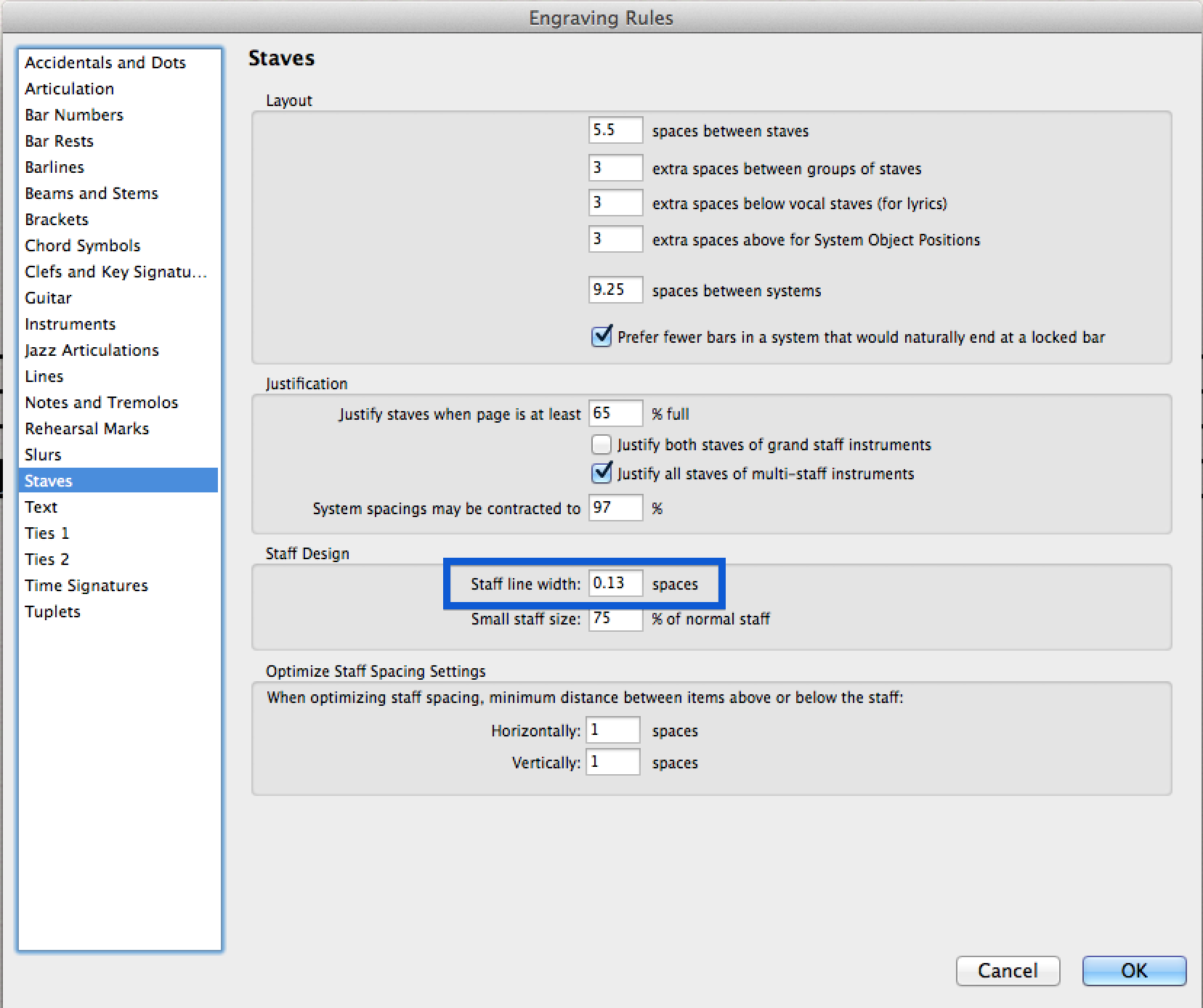
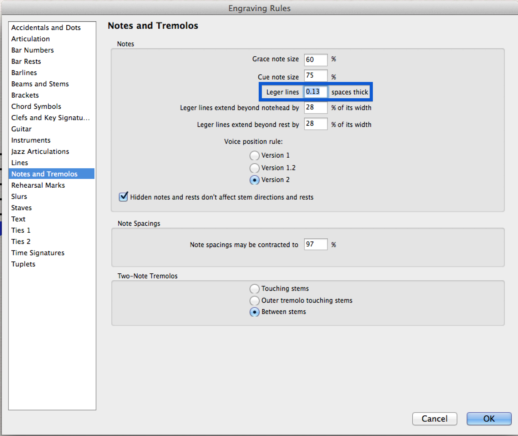
Next, set the ledger lines to the same thickness.
Finally, the stems.

I think the bar line thickness out of the box is fine, but if you want to tweak it further to taste, just click Barlines from the list on the left of the Engraving Rules.
Click OK and let's compare the results.

Before.

After.
There you have it. Your music is nearly instantly more legible already. Next time, let's get to work on all of that wasted space around the time signature.